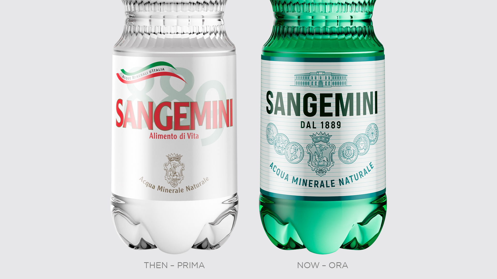
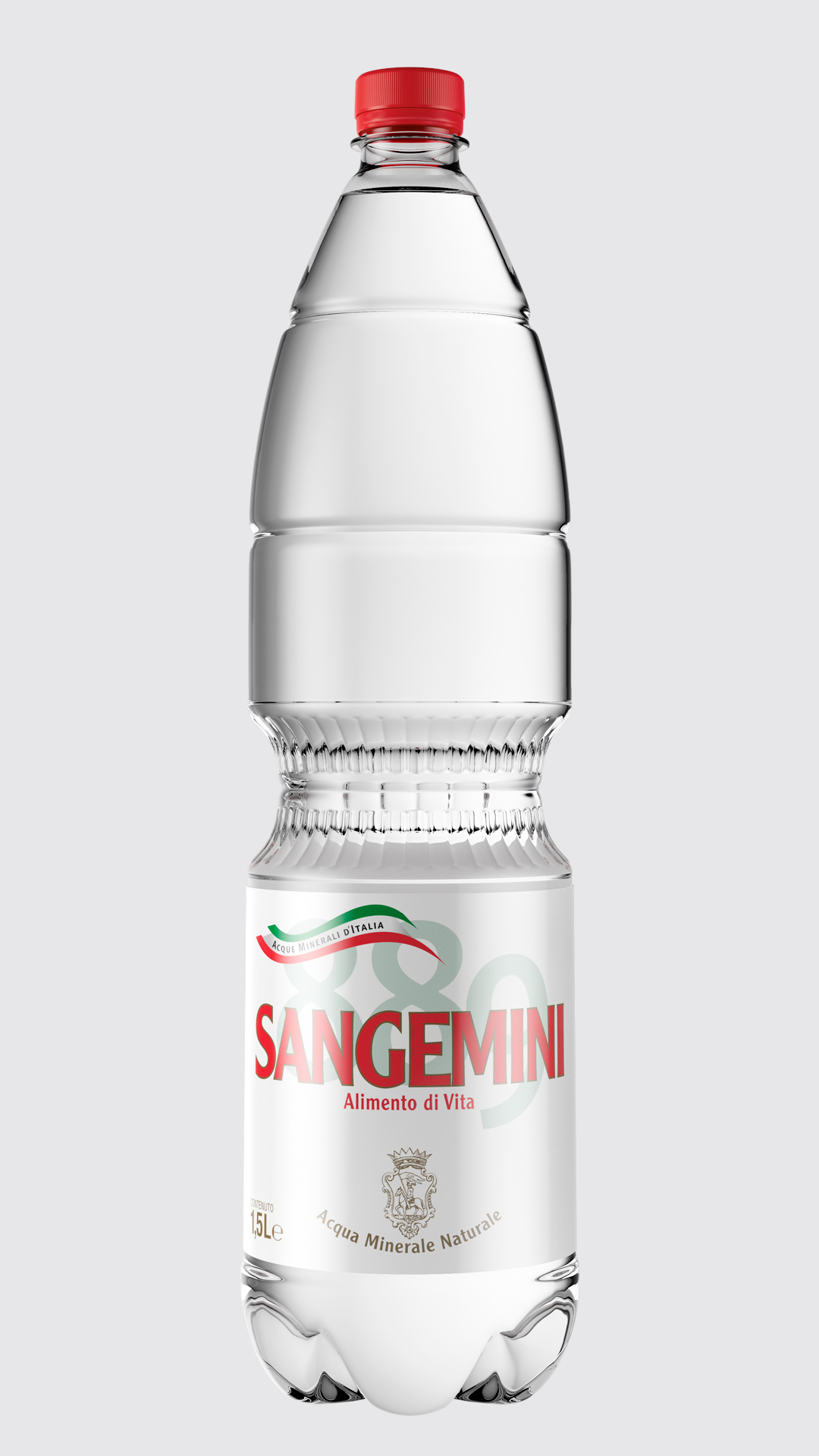
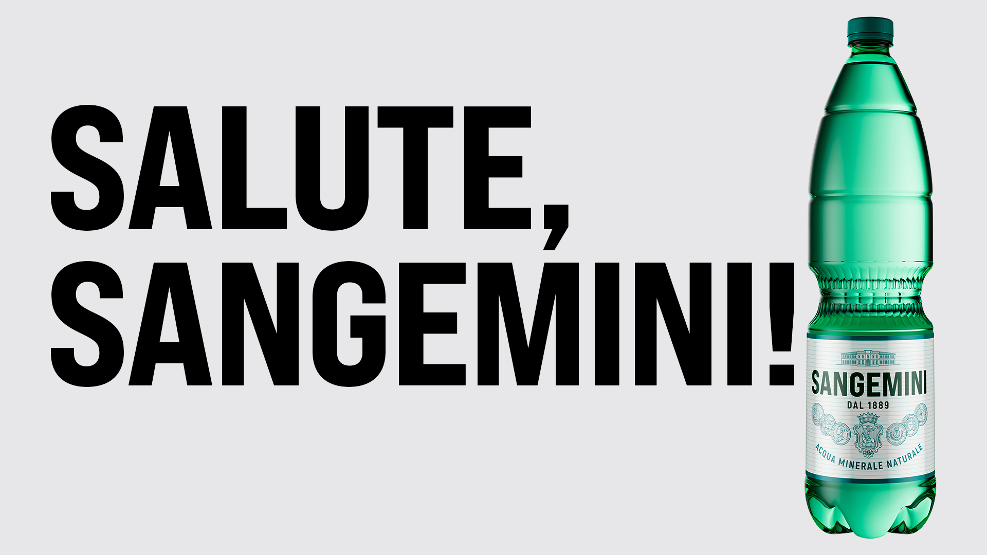
For Sangemini, we made a U-turn by drawing inspiration from the design of its origins. Taking inspiration from the past does not always work: the risk is called nostalgia. In this case, however, the step backwards served to correct a misstep. In fact, the design of the early 2000s left out a good chunk of memory and Sangemini’s speaks of health, a brand promise since 1889.
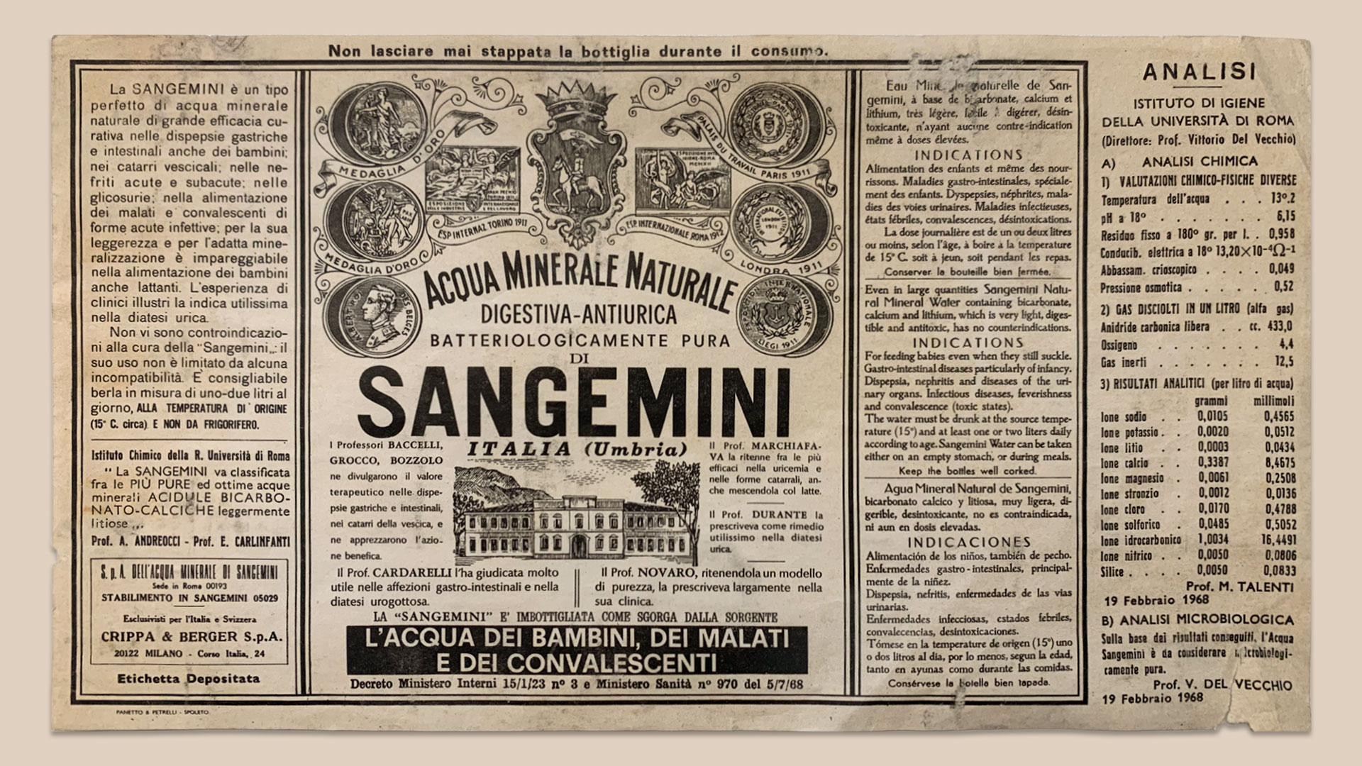
Umbrian water was born more than a century ago and it was at that time that Sangemini founded its language, which it has kept constant over time. After the 2000s in which design had wiped out the connotations of this historic brand, the strong and clear will was to recover its original identity and relaunch it.
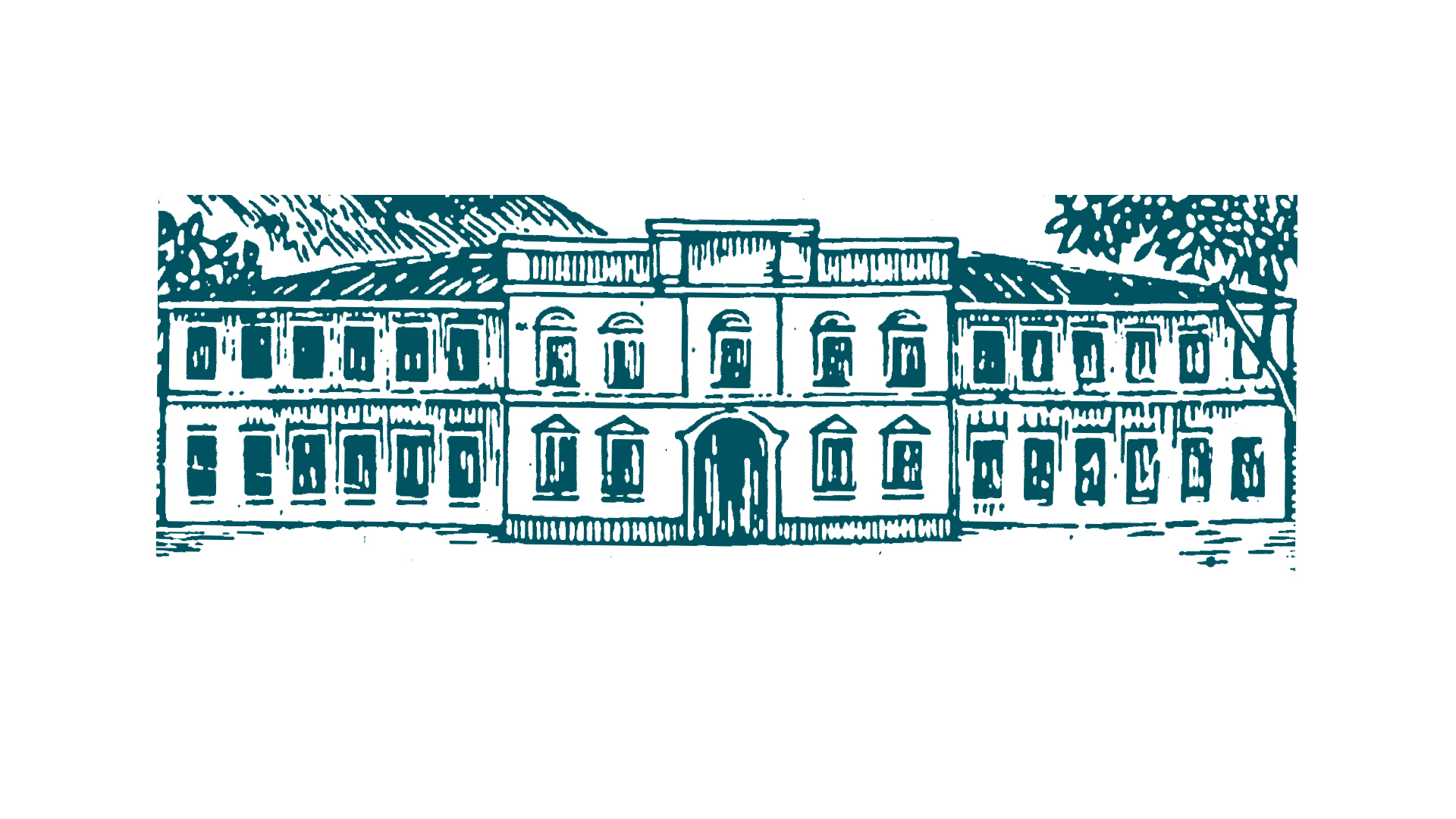
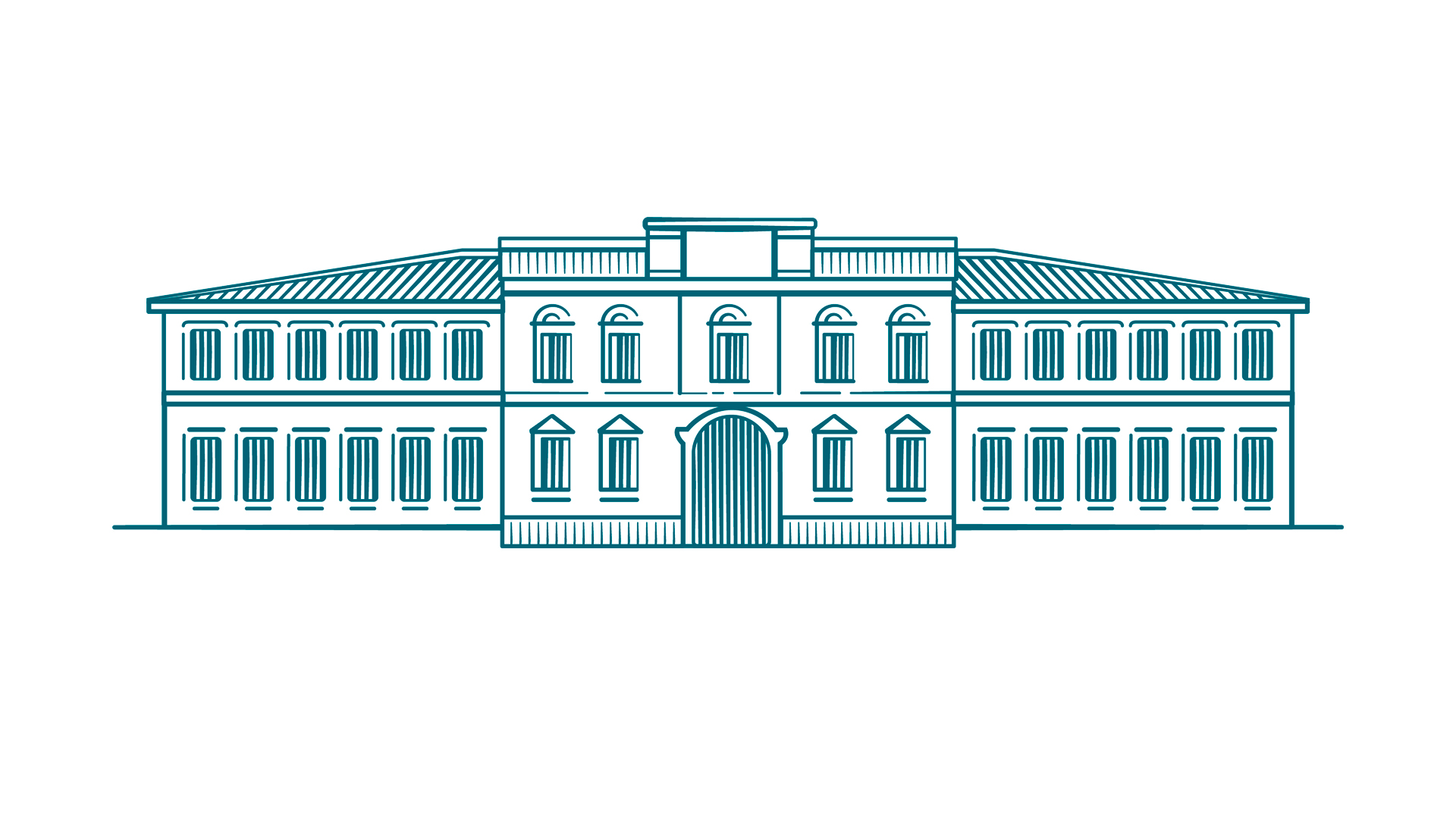
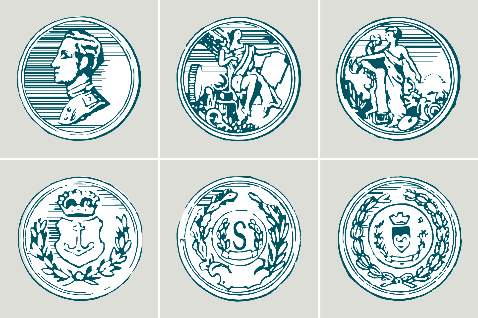
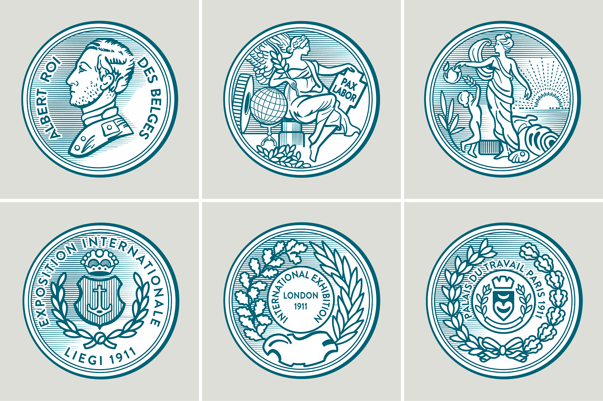
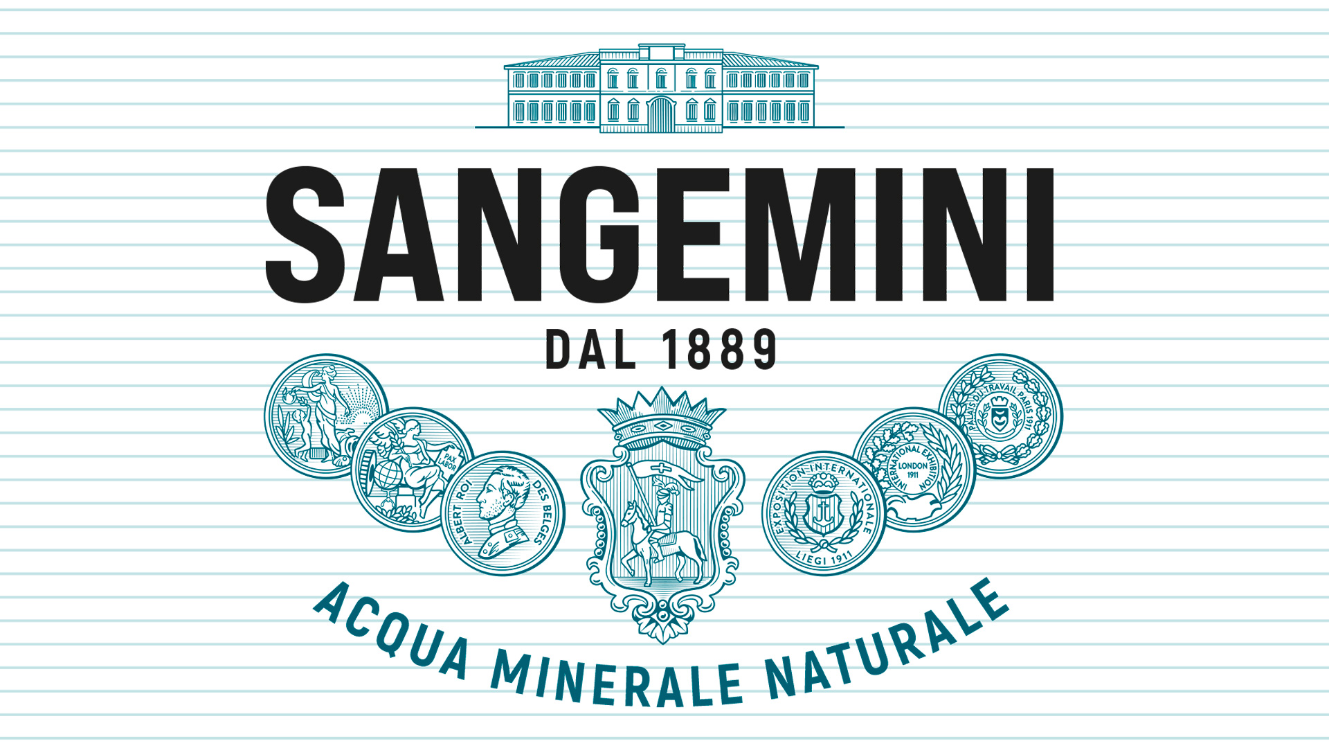
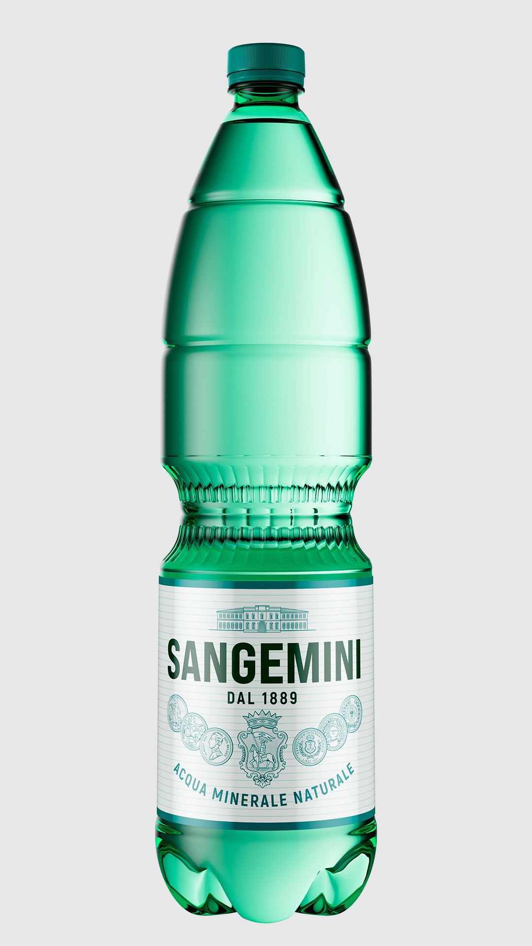
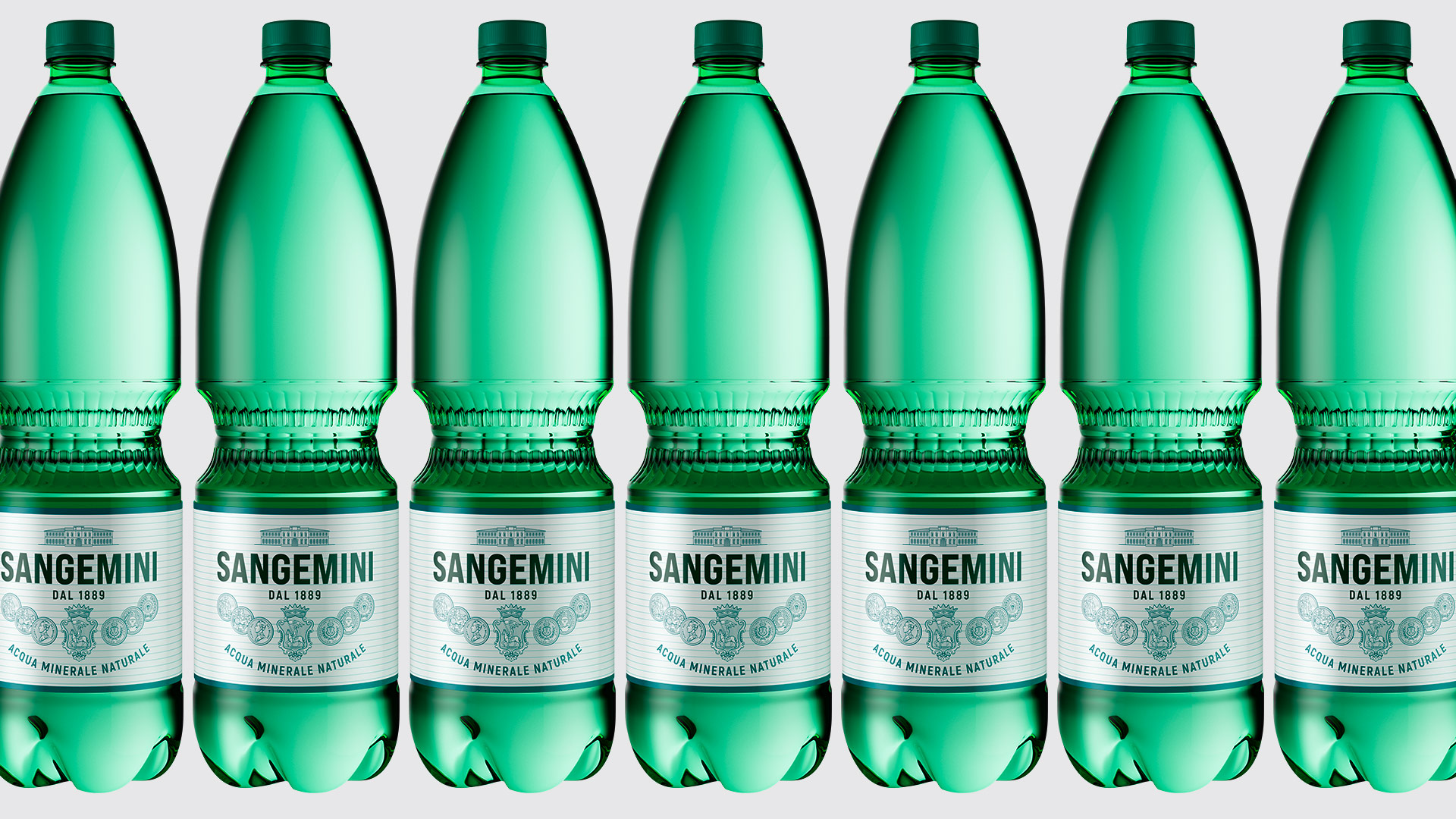
And so we took the expressive elements native to Sangemini, patiently redesigned them and gave them back ‘as good as new’: a true conservative restoration operation and something more. Completing the manoeuvre was the return of the bottles to green, an unmistakable Sangemini code.


What we did for this brand
Visual identity redesign
Label design
Advertising
You might like
Planning a new project? Call us.